Candle Website Redesign
This assignment involves improving the usability and visual appeal of an eCommerce website by redesigning it. Students will select one of four companies—B&M Trading, Writer's Block Bookstore, Candles by Victoria, or Luna Mosaic Arts—and follow a structured process to create a more user-friendly and aesthetically pleasing website.
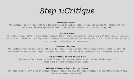
Step 1: Critique
The first step in my project was analyzing the original website, "Candles by Victoria," and identifying areas for improvement. One major issue I noticed was that the homepage layout was overcrowded, making it overwhelming for users to navigate. Simplifying the layout and adding more spacing could improve the user experience. Another issue was the lack of a consistent design theme—different fonts and colors made the site look outdated and bland. By applying a cohesive color scheme and font style, the website could feel more modern and attractive. The customer reviews section was hidden, which made it harder for users to find and trust the site. Relocating the reviews to a more visible area, like near the product pages, could encourage purchasing decisions. The search bar was another problem; it was hard to spot, so moving it to the top of the page would make it more accessible. Lastly, the site did not work well on mobile devices. Improving its mobile responsiveness would allow customers to shop easily on their smartphones. These critiques formed the foundation for my redesign.

Step 2: Research
To guide my redesign, I researched two eCommerce websites with strong usability: Crate & Barrel and Allbirds. Crate & Barrel impressed me with its clean and modern design. Its massive menu and categorized homepage made it easy for users to find products. High-quality images and detailed filtering options enhanced the shopping experience, making browsing simple and enjoyable. Allbirds stood out for its simplicity and balance. The product pages were detailed, with clear descriptions, close-up images, and videos that helped customers make informed decisions. The site also prominently displayed customer reviews and product recommendations, which built trust and encouraged exploration. These features inspired me to focus on organization, visual appeal, and accessibility in my redesign.

Step 3: Ideation
During the ideation phase, I experimented with potential color schemes and typography to set the tone for the redesign. For color schemes, I explored options like "Elegant Naturals," which featured earth gray, moss green, and lavender, as well as "Warm and Cozy," which used cream, soft peach, and warm cinnamon tones. I wanted the design to feel inviting and reflect the brand's aesthetic. For typography, I tested combinations like Roboto Slab for headings and Open Sans for body text because of their readability and modern look. Then, I created sketches for six key pages: the homepage, about page, product catalog, shopping cart, checkout page, and account history page. These wireframes helped me visualize how the redesigned content would be structured, with sections for newest products, specials, and customer reviews clearly defined.


Step 4: Improve and Prototype
In Figma, I brought my wireframes to life by creating high-fidelity prototypes. I chose Roboto Slab for headings and Open Sans for body text, which provided a clean and professional look. For the color scheme, I leaned toward a light, creamy yellow as the secondary color, paired with white as the primary color and a soft gray as the accent. On the homepage, I highlighted featured items, newest products, and customer reviews in a clear, organized layout. The about page emphasized the brand's values with a simple design featuring an image and brief text. The product catalog page used a grid to display items cleanly, with sorting options for better usability. The shopping cart and checkout pages were streamlined to make the process faster and easier. Lastly, the account history page showed past orders in a way that was easy to understand. Each page improved on the original design by being more visually appealing and user-friendly.


Step 5: Compilation
The final step was compiling all my work into a single Figma file. I organized the file into four pages, including sections for critique, research, ideation, and prototypes. While this was my first time using Figma, I made sure to include all the elements, from screenshots of the original website and research examples to color and typography studies, wireframes, and final designs. Although my file hierarchy was a bit messy, the process taught me how to structure my work better for future projects. Compiling everything in one place allowed me to reflect on the progress I made and see how each step contributed to the final redesign.
