

EcoMax
Sustainable Shopping Rewards App
EcoMax is a mobile app that rewards you for shopping sustainably. You scan your receipts, earn EcoPoints for eco-friendly purchases, find sustainable businesses near you, and trade your points in for real rewards. I worked on this with a team of five over two semesters. The first semester was research, planning out how users would move through the app, and designing it in Figma. The second semester was turning that design into a real, working app.

My Role
I did a little bit of everything on this project instead of sticking to one job. I helped come up with the process we used for user testing, including the tasks we gave people to try and the questions we asked them afterward. I also helped build the design and the Figma prototype, and then helped refine it so it would appeal to the kind of person we were designing for: someone who wants to shop more sustainably but doesn't want it to be complicated.


The Design
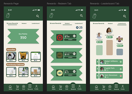
The app has five main screens: Home, Shop, Scan, Rewards, and Profile. They're all in a bar at the bottom of the screen that never goes away, so you can reach any of them with your thumb. People use EcoMax while they're shopping or right after they check out, so we made sure nothing takes more than one to three taps.
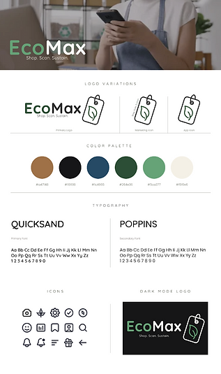
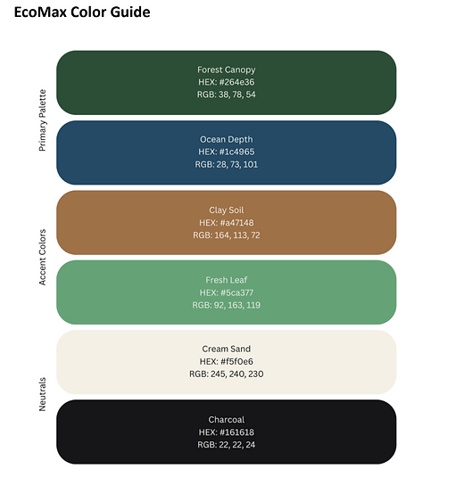
We built a design system to keep everything consistent. We used Quicksand for headings because it feels friendly, and Poppins for body text because it's easy to read on a small screen. The colors are deep greens, a warm brown, and soft neutrals, which fit the eco theme and keep the app feeling calm instead of loud. We also added progress bars, badges, and a confetti animation when you successfully scan a receipt, so using the app feels rewarding.
The Build
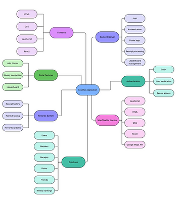
We built the app using React Native and Expo, which let us make one app that works on both iPhone and Android. The navigation is set up so the file structure of the code matches the flow of our Figma design, which made it easier to keep the two lined up. We built reusable pieces like buttons and cards once and used them everywhere, and kept all our colors and spacing in one place so nothing drifted out of sync.
Testing
We tested four times over the course of the project. We started with tree testing, then usability testing on our early rough version, then testing on the finished Figma prototype, and finally testing on the actual built app. For the last round, people scanned a QR code and used the app on their own phones while we watched and took notes. Navigation went well and the app matched our design closely. The main complaint was that the Home screen didn't look as good as it could, which is something we planned to fix.


The Membership Card
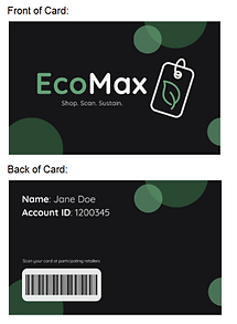
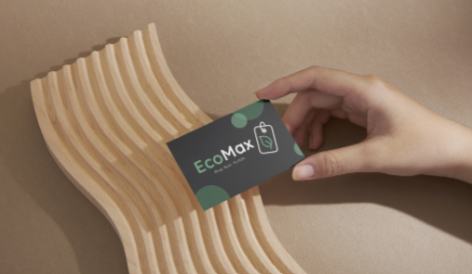
We also designed a physical EcoMax membership card. It's printed on recycled plastic with a barcode linked to your account. Stores that partner with EcoMax can scan it at checkout, and your purchase gets added to your account without you needing to open the app.
Conclusion
This was the longest project I've worked on, and going from a Figma file to an app you can actually open on your phone taught me a lot. The biggest thing I learned is how much a design changes once real people use it. Things that looked fine in the prototype didn't always feel right in someone's hands, and the only way we found that out was by testing and asking questions. Working on a team of five also meant staying organized and keeping our design consistent across everyone's work, which got easier once we built a system we could all follow.
Final Report
Click the PDF icon to view!