Comet Tales Team Design
1. Project Idea
In my User-Centered Design course, I worked with a team on a semester-long project called Comet Tales, an AR/VR learning app about space and history. Even though we collaborated as a group, I was the UX Designer, so I focused on the user journey, navigation flow, and screen layouts. The big idea was to use AR and VR technology to make learning about planets, celestial events, and space history interactive and exciting. My role was to take the initial concept and shape it into a user-friendly design that would work for different audiences, like students, educators, and casual VR users.

2. Market Research
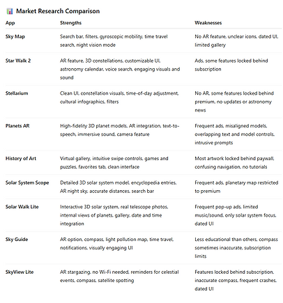
For the research stage, I studied existing space and AR/VR apps to see what worked well and what needed improvement. I compared apps like Sky Map, Star Walk 2, Stellarium, Planets AR, and several others. For example, I liked how Sky Map used gyroscopic motion to move with your phone, but it lacked AR and had a very dated interface. Star Walk 2 stood out for its AR features and 3D constellations, but I didn’t like how many features were locked behind subscriptions. Stellarium impressed me with its clean design and cultural infographics, but again, it didn’t include AR. On the other hand, Planets AR had great high-fidelity models in AR, but frequent ads made it frustrating to use.
By comparing the strengths and weaknesses of each app side by side, I was able to identify which features we should bring into Comet Tales—like AR planet exploration, simple navigation, and strong visuals—and which problems we needed to avoid, like cluttered interfaces or confusing icons. This research step helped me set a clear direction for my designs in the next phases.

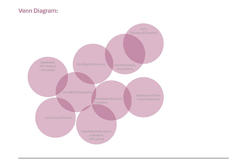
3. User/Stakeholder Analysis
I helped define who our users and stakeholders were. For users, we created profiles for space enthusiasts, students, teachers, casual VR users, and even historians. We also considered VR developers who might analyze our app’s usability. For stakeholders, we looked at groups like museums, VR hardware companies, and sponsors who would care about education and technology innovation. My job here was to take these user profiles and turn them into design goals. For example, since teachers needed structured learning, I designed options for guided storytelling. Space enthusiasts, on the other hand, wanted free exploration, so I planned navigation that allowed both. This step kept me focused on the idea that every design choice had to serve a real need.

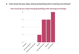
4. Collecting Feedback
I worked on creating interview and survey questions and then studied the responses. The feedback showed that most people valued hands-on and visual learning, and many said they liked the idea of clicking on planets for details or exploring guided tours with an option to branch out. Some also wanted immersive features like spacewalk simulations and AR tools to zoom into planets. I summarized these findings and turned them into feature priorities for my designs—for example, creating a planet detail page with facts and an AR button for exploration. This step gave me clear evidence that the design needed to support both education and fun exploration.


5. Task Analysis
To better understand common usability issues, I conducted a task analysis on the app Solar System Scope. I asked a user to try to learn more about Mars while I observed and documented their process using a think-aloud protocol. I recorded every step they took, including when they pressed the wrong button, got confused, or expressed frustration. For example, the user pressed the “Play” button expecting to see information about Mars, but instead it only controlled time settings. They also struggled with having to repeatedly go back to the search feature just to access Mars again. I turned these observations into a hierarchical task analysis diagram that broke the process down into small steps and highlighted moments of confusion, errors, and frustration. This helped me see that clear instructions, feedback, and shortcuts were missing in existing apps. I applied these lessons to Comet Tales by making sure users could quickly access planets, get facts without leaving the page, and easily return to their last view.

6. Data Structure and Navigation
I created the information architecture and navigation wireflow for the app. This meant planning how users would move from the home screen to features like “Explore Planets,” “Historical Missions,” the AR viewer, and the discussion board. I focused on making sure there were no dead ends—users could always return to the home screen easily, and major features were no more than one or two clicks away. I also added search, filter, and sorting options so people could organize what they were exploring. This structure was the backbone of my later prototype because it made sure the app had a logical, user-centered flow.

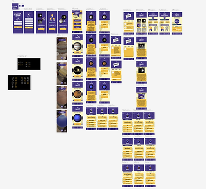
7. Paper Prototype
Once the research and analysis were done, I moved into sketching the first version of Comet Tales on paper. I drew layouts for the home screen, the “Explore Planets” section, the AR viewer, and the progress tracker. This step was important because it let me and my teammates test ideas quickly and make changes before spending time on digital mockups. For example, I tried different placements for the “Explore Planets” button and experimented with how to show tabs for facts, AR, and historical missions. Seeing it on paper made it easier to identify what felt too cluttered or what needed to stand out more.
This stage also gave me a chance to test the flow with classmates. Even though the drawings were simple, people could understand where things were located and how they might navigate. Their feedback confirmed that the flow made sense and gave me confidence to move forward into Figma.


8. High Fidelity Figma Prototype
After finalizing the navigation flow on paper, I designed a high-fidelity prototype in Figma. I built interactive screens for the home page, planet exploration, AR view, discussion board, and progress tracker. My focus was on keeping the design clean, consistent, and easy to navigate. For example, the home screen had clear entry points to the main features, and the planet exploration screens included tabs for facts, AR mode, and historical missions. I used simple colors and icons so users could focus on the content.
I also tested this prototype with users. They explored Jupiter in the app, clicked on tabs for facts, and tried to use the AR feature. Through this, I noticed some issues—for instance, users weren’t sure how to start the AR mode, and some clicked on inactive icons expecting them to work. I documented these problems and suggested improvements, like clearer button labels, more feedback when features were loading, and separating confusing icons. This testing step helped me refine the design so it felt smoother and more intuitive.
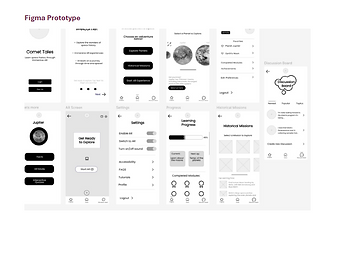

Before reaching the final prototype, I created three different high-fidelity design options in Figma. Each design explored a different approach to layout, color, and interaction. For example, one design leaned on a darker theme to feel more immersive like space, another used brighter tones to make it more playful for younger users, and the last one focused on a minimal layout with strong AR integration. By building out these three versions, I gave my team and test users real options to compare so we could decide on the best direction.

After creating the high-fidelity mockups, I conducted user feedback sessions to see what people thought. I asked them to walk through common tasks, like exploring Mars or accessing the learning modules, and share what they found easy or confusing. The feedback showed that users liked the darker, space-like background for immersion but wanted the text to stand out more. They also preferred clear icons with labels to avoid confusion. This feedback helped me refine the visual style and make sure the interface balanced both clarity and immersion.

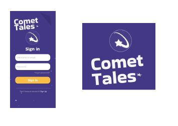
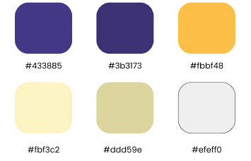
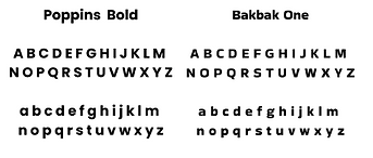
To keep the final prototype consistent, I developed a style guide. It included the color palette (deep space blues, accent purples, and bright highlight tones), typography choices, and icon styles. The style guide also explained button states, spacing rules, and how AR content should blend with the UI. Having this document meant that no matter what feature we added or adjusted, the app looked and felt like one product. It also made collaboration with my teammates much smoother since everyone had a reference point.
User Input Screen
Colors
Logo and Identity

Primary Identity Mark

Mobile App Icon

Typography
Buttons


9. Final Outcome
At the end of the semester, we delivered a fully interactive Figma prototype of Comet Tales. The app design included guided storytelling, free exploration, AR planet viewing, and a progress tracker to keep users engaged. My contributions as the UX Designer included researching competitor apps, building user profiles, analyzing survey data, creating task analysis diagrams, mapping navigation flows, sketching paper prototypes, and building the high-fidelity prototype in Figma.
The biggest lesson I took from this project was how to connect research directly into design choices. Every step, from comparing apps in the marketplace to watching people test my prototype, shaped the final product. This experience gave me practical, hands-on skills in UX design, from user research to prototyping and testing.