K-pop Mobile App Design
Part 1:
For this project, I created "KpopWave," a mobile app dedicated to K-pop fans. The app allows users to explore and purchase authentic merchandise while incorporating social sharing features like reviews, ratings, and favorites. As a passionate K-pop fan, I wanted to design a platform that combines the excitement of fandom with the convenience of online shopping. The goal was to address challenges like fake merchandise and high shipping fees while creating a vibrant and enjoyable experience for users.
Step 1: Inspiration and Brainstorming
My inspiration for this project came from my interest in K-pop and its enthusiastic fan community. While brainstorming, I considered several topics, such as fitness, travel, and DIY crafts, but I ultimately chose K-pop merchandise. This topic aligned with my personal interests and allowed me to design a unique app tailored to fans. I aimed to create a space where users could easily shop, share reviews, and connect with others who share the same love for K-pop.
Step 2: User Flow
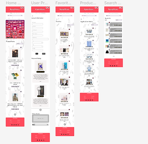
For the app’s primary function, I focused on browsing merchandise. The user journey begins on the home screen, where users can search for products or browse through featured collections. After selecting an item from the search results, they can view detailed product descriptions, read user reviews, and save items to their favorites or add them to their cart. This flow ensures that users can navigate seamlessly and enjoy a personalized shopping experience.
Step 3: Persona Study
To guide the design, I developed a persona named Mia Kim. Mia is a 21-year-old college student living in Los Angeles who loves collecting K-pop merchandise and staying up-to-date with the latest releases. She frequently encounters challenges like fake products, high shipping costs, and missing out on exclusive items. Mia’s goals include finding authentic merchandise, connecting with other fans, and enjoying a smooth shopping experience. Designing for Mia helped me focus on features like authenticity verification, new release alerts, and a simple, intuitive checkout process.
Step 4: Color Studies
I explored three vibrant color palettes that reflected the energy of K-pop culture:
-
Candy Crush: Candy Red (#FF4B5C), Sky Blue (#6EC1E4), and Mint Green (#A8E6CF) for a playful and bold look.
-
Sunset Glow: Sunset Orange (#FF8C42), Sunset Pink (#FF5964), and Gold (#FFD700) for a warm and energetic feel.
-
Pastel Dream: Pastel Pink (#FFB6C1), Pastel Purple (#D8BFD8), and Light Aqua (#AFEEEE) for a soft and dreamy aesthetic.
I chose Candy Crush because it best matched the vibrant and dynamic nature of the K-pop community.


Candy Crush


Sunset Glow

Pastel Dream
Step 5: Typography Studies
I tested several typography pairings to ensure readability and style. My final choice was:
-
Primary Font (Headings): Montserrat Bold
-
Secondary Font (Body Text): Open Sans Regular
This combination provided a modern and professional look while keeping text easy to read on mobile screens. The bold headers created a strong visual hierarchy, and the body font complemented the overall design.
Montserrat Bold:

Open Sans Regular:

Step 6: Design Process
I designed KpopWave with five key screens to meet user needs:
-
Home Screen: Features a search bar, trending collections, and quick links to the newest products.
-
Search Results Screen: Displays search results in a grid format with options to save or share items.
-
Product Listing Screen: Showcases detailed product descriptions, user reviews, and options to add items to the cart or favorites.
-
Favorites Screen: Allows users to organize and manage their saved items with a clean, colorful grid layout.
-
User Profile Screen: Includes user details, past reviews, and a summary of saved products.
The app integrates features like search, favorites, and reviews seamlessly, ensuring a smooth and enjoyable experience for users.

Step 7: Reflection
This project allowed me to combine my passion for K-pop with my design skills to create a unique mobile app. I focused on making the app visually appealing while ensuring usability and functionality. One challenge I encountered was balancing the vibrant K-pop aesthetic with a clean, user-friendly interface. Through this process, I learned the importance of prioritizing user needs while maintaining a cohesive design. I’m proud of how KpopWave reflects the energy of K-pop fandom and provides an engaging shopping experience for fans.
Want to Interact with Part 1 of the Finished Design?
Click Down Below!
Part 2:
For Part 2 of Project 4, I focused on improving my original KpopWave app design based on the identified areas for improvement. The goal was to refine the design, enhance usability, and create a polished, interactive prototype using Figma. This phase allowed me to address specific issues that impacted the app’s functionality and user experience while ensuring a cohesive and professional look.
Step 1: Design Rationale
In this phase, I identified five major areas for improvement in the original design and implemented solutions to enhance the app’s functionality and aesthetics.
-
Adding Sort By Filters
-
Issue: Users needed an easier way to sort through products by factors like price, popularity, or rating.
-
Reason for Improvement: Sorting options improve the browsing experience by helping users find what they’re looking for quickly.
-
Solution: I added a drop-down menu at the top of the product listing page with options for sorting by price, popularity, and ratings. This feature ensures that users can filter products easily and see results instantly, creating a smooth experience.
-
-
Adding Backgrounds to Pages
-
Issue: The original design had plain, bland backgrounds, which made the app feel dull and less engaging.
-
Reason for Improvement: Visually appealing backgrounds can make the app feel more polished and interactive.
-
Solution: I added subtle gradient backgrounds that complemented the app’s aesthetics without overwhelming the content. The backgrounds were tested to ensure they looked good across all devices and screen sizes.
-
-
Adding an Advertisement Section
-
Issue: The app lacked advertisements, which could be a source of revenue if implemented correctly.
-
Reason for Improvement: Relevant and well-placed ads can generate income without negatively affecting the user experience.
-
Solution: I added ad sections in non-intrusive areas, such as sidebars or between content sections. The ads were chosen to be relevant to the app’s audience, responsive, and lightweight to ensure they didn’t slow down the app or disrupt navigation.
-
-
Adding a "Write a Review" Section
-
Issue: The app did not allow users to leave reviews, which could build trust and community interaction.
-
Reason for Improvement: Allowing users to leave reviews provides valuable feedback for other customers and fosters engagement within the K-pop community.
-
Solution: I created a “Write a Review” section on the user profile page. This feature includes star ratings, comments, and options to upload photos or videos. The review process was designed to be intuitive and easy to use, with clear guidelines to ensure constructive contributions.
-
-
Fixing Inconsistent Fonts
-
Issue: The original design had inconsistent typography, which made the app look unprofessional and messy.
-
Reason for Improvement: Consistent fonts improve readability and give the app a unified, polished appearance.
-
Solution: I selected Nunito Regular for both headings and body text, ensuring this font is applied consistently across all pages. I reviewed each screen to ensure the updated typography was implemented correctly.
-

Nunito Regular

Step 2: Re-Design
After addressing the five key areas, I further refined the app by enhancing its overall design and functionality. This included:
-
Ensuring consistent spacing and alignment across all elements to improve visual hierarchy.
-
Adjusting button sizes and colors for better usability and accessibility.
-
Incorporating visually appealing elements to align with the vibrant energy of K-pop culture.
These improvements resulted in a more cohesive and professional design, reflecting the energy and engagement of the K-pop community while meeting users’ needs.
Step 3: Reflection
This project taught me the importance of iterating on designs to address usability and aesthetic concerns. By focusing on areas like sorting, backgrounds, reviews, and typography, I was able to refine KpopWave into a more polished and engaging app. The process highlighted the importance of aligning design decisions with user needs while ensuring visual appeal and functionality. Overall, I’m proud of the improvements and how they contribute to a better user experience.